A sharp Daiquiri Green lehenga beside a Rosy Future sari. Hibiscus against antique gold. Or an ivory sherwani lifted by the palest wash of Anise Flower.
Pantone’s Spring/Summer 2027 colour direction arrives at an interesting moment for Indian wedding fashion. After seasons dominated by blush, beige and quietly luxurious neutrals, colour is ready to have a little more fun.
Pantone describes its Spring/Summer 2027 outlook as one built around optimism, harmony and positive transformation. The broader mood moves between nature and imagination, calm and energy, softness and expression. (Pantone) That duality translates particularly well to Indian weddings, where one wardrobe may need to move from a sunlit haldi to a jewel-toned sangeet and a formal wedding ceremony within a matter of days.
Four shades from the New York Fashion Week Spring/Summer 2027 palette stand out especially strongly for that world: Rosy Future, Daiquiri Green, Hibiscus and Anise Flower. None needs to be worn exactly as it appears on a Pantone card. Their real potential lies in what happens when Indian textiles, embroidery, jewellery and occasion dressing give them another vocabulary.
Rosy Future: Pink Grows Up
Pink has never really left the Indian wedding wardrobe. What changes is its temperature.
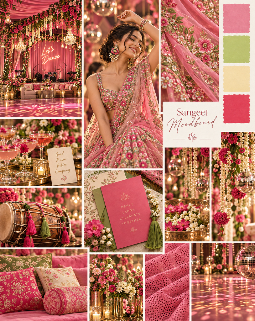
Pantone Rosy Future 15-1910 TCX sits between a soft romantic pink and something more confident. Pantone categorises it within the red colour family, and its position alongside coral and fuchsia tones makes it particularly adaptable for tonal dressing. (Pantone)
For Indian bridal fashion, this is not the almost-white blush that has dominated pastel weddings. Rosy Future carries enough colour to hold its own.
It could work beautifully for a daytime lehenga in silk organza, tissue or Chanderi, especially when paired with tonal embroidery rather than high contrast embellishment. Think rose-on-rose threadwork, pearls or restrained silver accents.
For bridesmaids, it offers an elegant alternative to everybody wearing exactly the same pink. A family palette could move through Rosy Future, deeper raspberry, rosewood and soft peach while still appearing coordinated.
The shade also opens up interesting jewellery possibilities. Polki and uncut diamonds would keep it classically bridal. Emeralds would sharpen it immediately.
Pair it with: burgundy for depth, emerald for contrast, antique gold for ceremony, or peach and fuchsia for a tonal pink story.
Best for: mehndis, daytime weddings, bridesmaids and summer destination celebrations.
Daiquiri Green: The Mehndi Colour Gets a Modern Reset
Green at an Indian wedding usually arrives with considerable cultural baggage. There is emerald. Mehndi green. Parrot. Bottle. Sage.
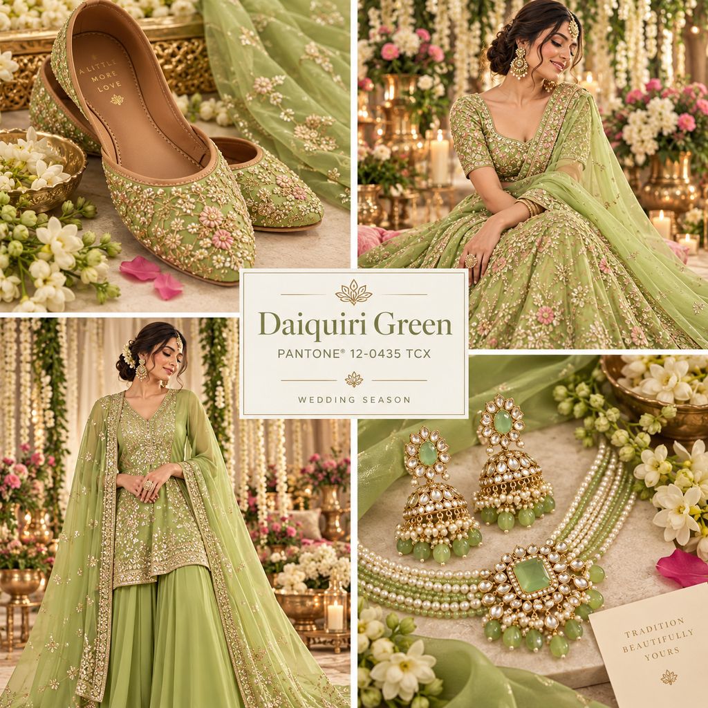
Daiquiri Green 12-0435 TCX changes the conversation.
It is bright, acidic and youthful without tipping completely into neon. Against silk, organza or translucent fabrics, the colour could feel especially fresh.
The obvious destination is the mehndi, but using it only there would undersell it.
A Daiquiri Green pre-wedding lehenga with ivory embroidery could create a cleaner alternative to densely multicoloured mehndi dressing. Against silver gota, mirror work or crystal embellishment, the colour becomes playful. Pair it with dull gold and the mood shifts towards something more traditionally Indian.
It is equally interesting beyond the bride. A sharply cut kurta, bandhgala accent or dupatta in the shade can introduce colour into menswear without falling back on expected jewel tones.
For a more fashion-led wedding, use Daiquiri Green sparingly against neutral clothing. An ivory sari with a green blouse, a lime dupatta over cream, or even green enamel jewellery against gold can make the palette feel directional without overwhelming the wearer.
Pair it with: ivory for freshness, hot pink for high-impact Indian colour, cobalt for a fashion-forward contrast, or gold for a more ceremonial finish.
Best for: mehndi celebrations, poolside functions, destination weddings and contemporary daytime dressing.
Hibiscus: A Red That Does Not Need to Behave Like Bridal Red
Indian bridal fashion will probably never truly abandon red. Nor should it.
The more interesting evolution lies in expanding what “bridal red” can mean.
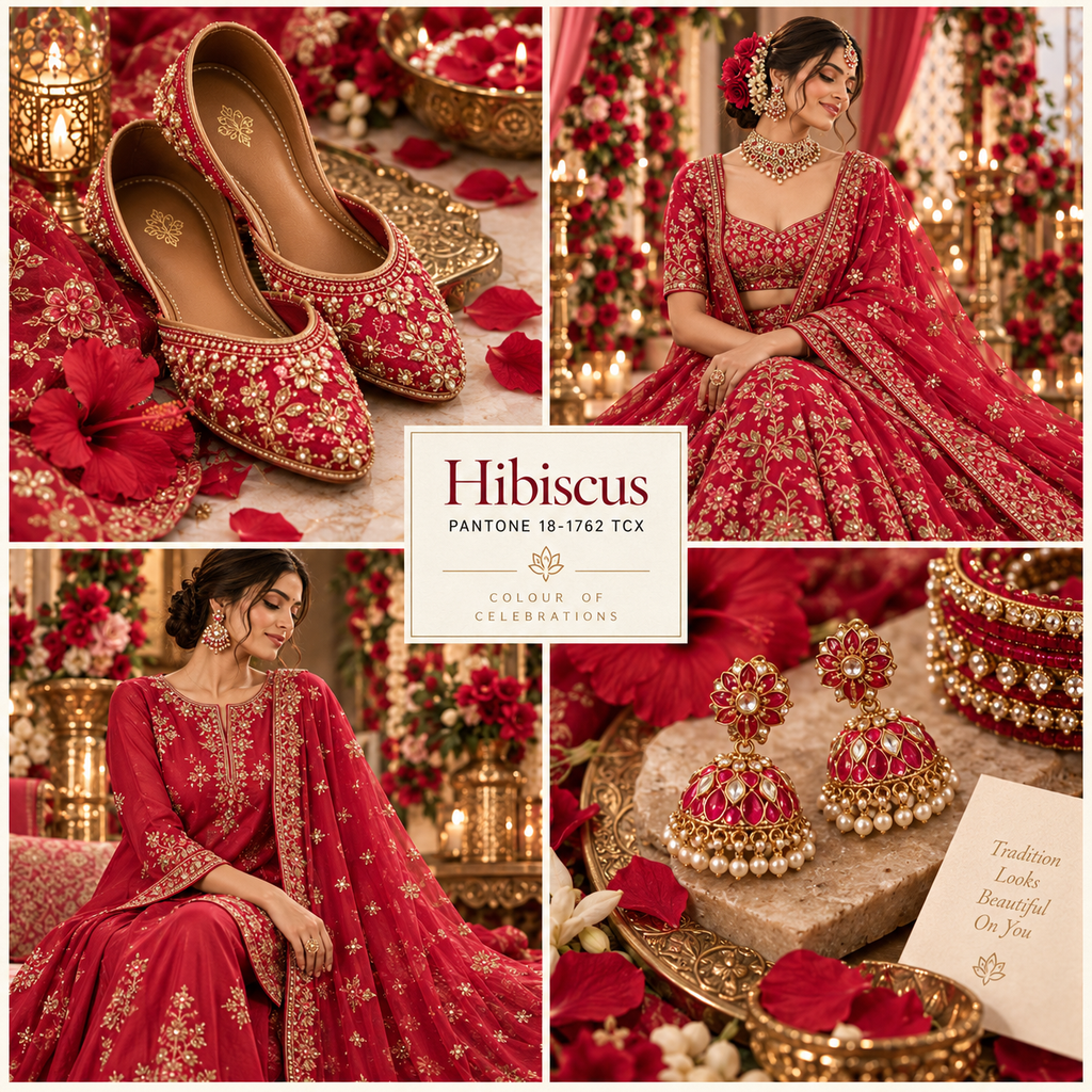
Hibiscus 18-1762 TCX brings a vivid, flower-led intensity to the palette. It feels more energetic than a deep maroon and more substantial than coral.
That makes it particularly suited to brides who want the symbolism and visual authority of red without choosing the expected vermilion or wine palette.
Hibiscus can carry embroidery extremely well. Antique gold would make it feel richer and more traditional. Tone-on-tone beadwork or thread embroidery would allow the colour itself to dominate. Paired with diamonds rather than heavy yellow gold, it could move easily into a reception or cocktail wardrobe.
There is also room to use it away from the main wedding ceremony. A sculpted Hibiscus gown, concept sari or lehenga for a sangeet would photograph strongly under evening light.
For family dressing, it can act as the anchor colour in a wider palette. Rather than placing every member in red, build outwards through raspberry, rust, blush and aubergine.
Pair it with: antique gold for grandeur, aubergine for richness, Rosy Future for tonal layering, or muted sage for an unexpected contrast.
Best for: wedding ceremonies, sangeets, receptions and statement occasion dressing.
Anise Flower: The New Neutral Is Not Quite Neutral
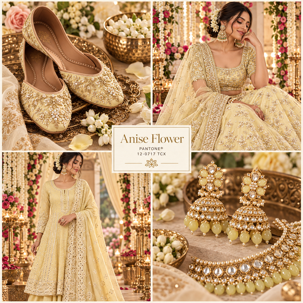
At first glance, Anise Flower 12-0717 TCX may seem like the quietest shade of the group. That is precisely its strength.
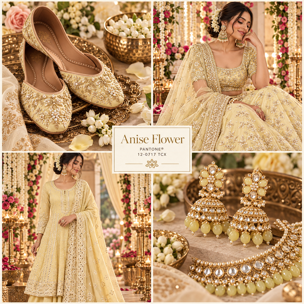
It sits in the space between cream, pale butter and a delicate warm yellow. For Indian weddings, it offers a softer alternative to stark ivory and a more sophisticated interpretation of the yellow traditionally associated with haldi functions.
This is the shade for someone who prefers restraint but does not want beige.
Imagine Anise Flower in handwoven silk with old-gold zari. Or as a diaphanous organza sari with pearls. For menswear, it could replace conventional cream in an achkan or sherwani while retaining the formality required for a wedding ceremony.
Its warmth also makes it useful as a foundation colour.
Rather than building an entire outfit around it, designers and stylists can use Anise Flower as the base against which stronger Spring/Summer 2027 shades emerge. Rosy Future embroidery would make it romantic. Hibiscus borders would give it energy. Daiquiri Green accents would take it somewhere much more contemporary.
Texture will be important here. Pleating, brocade, tonal embroidery and layered translucent fabrics prevent the pale shade from feeling flat.
Pair it with: old gold for understated luxury, Rosy Future for softness, Hibiscus for a stronger wedding contrast, or Daiquiri Green for something distinctly modern.
Best for: haldis, morning ceremonies, intimate weddings, groomswear and elegant family dressing.
Four Colours, One Wedding Wardrobe
The most interesting way to use Pantone’s 2027 colours may not be individually at all.
Indian weddings already understand something global fashion often has to rediscover: several strong colours can coexist beautifully when their proportions are right.
Rosy Future + Hibiscus offers an easy tonal story. Let the softer pink dominate and use the red in embroidery, borders or jewellery details.
Daiquiri Green + Rosy Future gives the classic Indian pink-and-green combination a sharper 2027 update. It would work particularly well across a mehndi party, with guests moving between the two colours rather than wearing matching outfits.
Anise Flower + Hibiscus is perhaps the most wedding-ready combination. The pale warm base allows the red to appear richer without the severity of pairing it with pure white.
Anise Flower + Daiquiri Green feels younger and more unexpected. Use the green as the accent rather than splitting the colours equally.
For a wedding party rather than a single outfit, all four can coexist. Anise Flower acts as the visual pause. Rosy Future softens. Daiquiri Green energises. Hibiscus anchors the palette.
The result is colourful without becoming chaotic.
Let the Fabric Change the Colour
One reason Pantone palettes translate so interestingly into Indian fashion is that colour rarely appears here as a completely flat surface.
The same shade behaves differently across raw silk, velvet, tissue, chiffon and Banarasi brocade.
Anise Flower in matte cotton silk may appear gentle and understated. Put it into luminous tissue and it immediately feels more ceremonial.
Hibiscus in velvet gains depth. In chiffon, it becomes lighter and more fluid.
Rosy Future can lean romantic in organza but more formal in a woven silk. Daiquiri Green becomes particularly striking when sheer layers allow light to move through it.
Pantone itself distinguishes between colour standards for textiles and those intended for harder surfaces, highlighting how materially dependent our perception of colour can be. (Pantone)
For wedding fashion, this is an important point. Do not choose a colour from a digital swatch alone. Choose how you want the colour to feel, then find the textile that gives it that personality.
Take the Palette Beyond the Bride
A wedding colour trend becomes much more interesting when it escapes the bridal lehenga.
Rosy Future could appear in bridesmaids’ saris, floral details or embroidered juttis. Daiquiri Green works beautifully for groomsmen, resort dressing and festive accessories. Hibiscus can move into family wardrobes, cocktail saris and statement dupattas. Anise Flower offers perhaps the widest possibilities, from the groom’s sherwani to the mother of the bride’s sari.
The colours can also connect fashion with the wider visual language of the wedding.
A hint of Hibiscus in flowers can pick up the bride’s outfit without producing a fully matched set. Anise Flower in tablescapes can soften stronger clothing palettes. Daiquiri Green can appear in smaller décor details without turning an entire venue lime.
The aim is not coordination for its own sake. It is continuity.
Indian Wedding Colour Is Ready to Have Fun Again
Pantone’s Spring/Summer 2027 direction speaks of optimism and expression, but its relevance to Indian wedding fashion lies in something even simpler.
It gives colour permission to be joyful again.
Minimalism has changed bridalwear for the better in many ways. It has made space for craftsmanship, softer palettes and quieter forms of luxury. But quiet luxury does not require quiet colour.
Rosy Future can be romantic without becoming predictable. Daiquiri Green can make traditional green feel new. Hibiscus can rethink bridal red without abandoning it. Anise Flower can offer subtlety without disappearing into beige.
The smartest way to wear the 2027 palette will not be to reproduce Pantone’s colours literally. It will be to let Indian craft transform them.
A little zari. A flash of meenakari. A handwoven textile. An unexpected blouse. Perhaps two colours that, on paper, should not quite work together.
Indian weddings have always known that colour becomes far more interesting once you stop asking it to behave.